So far in the growth process I’ve undergone as an author, few lessons stand out as being more valuable than getting a professional to do one’s cover, even when the overall goal is to self-publish. Think about it for a minute: a downside of the self-publishing revolution is that your book, to sell well, has to stand out from among millions of competing titles, and not just within physical space on a shelf. It has mere seconds to draw and keep the attention of a reader searching through a wide database of titles, assuming it even meets the eyes of a reader in the first place.
The cover for The Seal of Thomerion was done by a gentleman that goes by the online name of Andrei Bat, whom I found by running a contest on http://www.99designs.com. 99 Designs is a fantastic site by which you can hire out this sort of visual work, but be warned, even the cheapest plans require a significant investment. I can tell you, however, that it has been worth it, even after the winning artist took my original concept in a completely unanticipated direction. The haunting appeal of the green, shady color scheme, in combination with the intrepid central character marching off into the horizon and the macabre Seal itself, have created awareness for the book it would have never otherwise achieved.
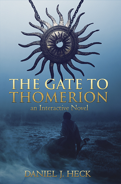
Above, I’m showing you, the public, the art for the cover for The Gate to Thomerion, for the first time. In place of the Seal, the sun talisman that this book’s protagonist, Bartleby the cleric, uses is positioned so as to draw the eye, and once again, I employed Andrei to make it all happen. He equalled, perhaps even surpassed, the quality of his previous work by placing the cleric in a different setting than the first book’s dwarf, while reproducing the overall atmosphere.
As the Thomerion books will eventually become a trilogy, I currently plan to request a cover for the final book (The Wrath of Thomerion) that will have a red color scheme, to complement the green and blue in the first and second books, respectively.
For now, as my development on the sequel continues (currently standing at 170 pages and shooting for at least 220), my gratitude for those whose artistic skill and vision exceed mine knows no bounds. If you’re in the business of writing, you may be tempted to do your own covers; after all, there’s nothing about self-publishing that quite rivals the freedom you have to wear as many hats as you want. But I can practically guarantee you that whatever you make will be inferior to what you could hire out.
And when you hire, know what you want and why you want it. The cover absolutely must give the reader a sense of what is inside. A former acquaintance of mine entitled a book of his “Salad Days,” (as it reflects some of his personal experiences related to nutrition), yet the cover includes a hiker wearing a vest and holding a staff, with two soldiers of some sort in the background. Don’t allow this kind of discordance to creep into your covers, or else you’ll confuse potential readers before they even open to the first page.
Keep an eye on this space for more, including a piece on what makes your Amazon search terms optimize the possibility of your book being found by readers.

Thank you for sharing this. Professional art tells potential readers that you take your work seriously; that you’re more likely to be the type of writer who took the time to carefully edit and present your work well. I’m glad it got me to pick up your book.
LikeLike